A lot of content marketers treat the design team like a vending machine – insert copy, press button, get graphic.
They make design the last step in the content creation production process. The result is nearly every piece of content is planned through the lens of a writer. By the time a typical creative brief fights its way past a tyrannical project manager and reaches a designer, it’s set in stone.
Yet, design is arguably the more important half of content creation. (Heretical, I know.) If a layout is wonky, text is hard to follow, or graphics are a weird mismatch, readers may never consume the text.
#Design is the more important half of content creation. Yet, too many marketers treat designers like a vending machine, says @cgillespie317 via @CMIContent @Canto. Click To Tweet
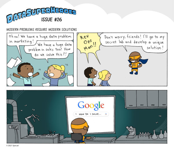
If designers had more input, they could turn those staid text ideas often published as e-books or blog articles into engaging content formats, such as Syncari’s comic series, Chili Piper’s graphic novella, Guru’s template gallery, and Dumpling Delivery’s game.

Sometimes, the mere sensation of doing things differently gives your content a serious competitive advantage.
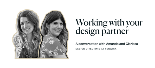
How can you unlock that latent design potential in your organization? I asked two design directors at Fenwick. Their input changed my idea for this article considerably.

Involve designers early in the process
Amanda Tennant and Clarissa Kupfer, design directors at Fenwick, say it’s important to recognize no two designers are alike. Some are more equipped than others to be brought into the process early. A creative director is likely experienced in pitching ideas, but a production designer is often happier when they receive strict instructions.
1. Invite designers to planning meetings
Add your design partner to (nearly) every planning call. Yes, I know. Their project manager will flip out. It feels inefficient. But you are adding a second brain with a second pair of eyes, and they’re going to see things you cannot. Fenwick does this frequently and we come up with lots of cool things.
Involve designers in #content planning calls. Their second pair of eyes will see things you cannot., says @cgillespie317 via @CMIContent @Canto. Click To Tweet
For example, Fenwick did a rebrand project for a startup founder who used an odd color palette in the software he built. Amanda asked why and learned the founder is color blind. He literally sees the world differently. That influenced the corporate identity they built for him.
“Great storytelling is born from the co-exploration of an idea,” says Clarissa. “Recently, we had a client launching a webinar series for busy and stressed accountants. Rather than pack in more advice, I had the idea to do less and introduced a mantra slide where the speaker would pause and offer words of affirmation. It was so well received, an attendee printed it out, framed it, hung it on their office wall, and sent a picture.”
Great #storytelling is born from the co-exploration of an idea, says @ckupfr via @cgillespie317 @CMIContent @Canto. Click To Tweet
ADVERTISEMENT
The Essential Guide to Brand Management
In this e-book, we outline everything you need to know to manage your digital brand identity – with tips to create a consistent brand experience across every touchpoint. Download the e-book now.
2. Encourage designers to follow their curiosity
Give your design team time to do their own ideation. Plan time for your designer to meet your subject matter expert and talk concepts. By doing this, Amanda often helps companies turn mundane interstitial graphics into something that both explains and guides.
“On a recent project, we were unsure how to bring a graphic to life, so I scheduled time to talk to the subject expert,” Amanda says. “Ends up, he didn’t love the graphic either. But he felt he didn’t have the drawing skills to bring his real dream analogy to life. What was it? A sandcastle. After a lot of playing around with that idea, we realized it could serve as both an analogy, and a sort of progress bar as you scroll through the article.”
As readers scroll through the article, the sandcastles act as a progress bar. In the visual below, the sandcastle representing the devpro stage sits without a turret, while the complete product stage includes the turret with a flag on top.

3. Leave time and budget for your design partner to involve experts
The best designed projects are a collaboration among highly skilled, somewhat narrow visual experts. Recognize your designers may need to involve specialists outside their team.
“Nobody’s a Swiss Army knife. Concealed within the title ‘designer’ are dozens of potential areas of expertise,” Clarissa says. “Your design partner is likely a specialist in one or two areas and a generalist in all the others. If you rush, they’ll have to do everything. But if you leave time, they can find experts to innovate in areas they can’t.”
No designer is a Swiss Army knife. Call upon specialists when you need them, says @ckupfr via @cgillespie317 @CMIContent @Canto. Click To Tweet
Fenwick, for example, relies on a freelancer to do delicate line drawings, such as the images below for Christine Deakers and Suhas Sreedhar who were profiled in a series on content operations.

Don’t forget the project manager
Involving designers early can be seen as wasteful or a move away from the waterfall process. Get your project managers to buy into the concept. It’s worth the effort when you can involve your designer early and they have the freedom to say, “What if instead, we did X?”
The value of those collaborations with designers only grows as you work more together.
So, this week, crack open the design vending machine. Invite your designer to coffee, give them a seat at your next content ideation meeting, and see what happens when they aren’t forced to color within the lines left by non-designers.
HANDPICKED RELATED CONTENT:
Cover image by Joseph Kalinowski/Content Marketing Institute
Follow us on Facebook | Twitter | YouTube
WPAP (697)


