Facebook Cover Photo Size
The ideal size is 820 pixels wide by 462 pixels tall.
According to Facebook, your cover photo is displayed at 820 pixels wide by 312 pixels tall on your Page on desktops and 640 pixels wide by 360 pixels tall on smartphones.
But if you want to use a single image that works pretty well on both desktop and mobile, 820 pixels wide by 462 pixels tall seems to be the best.
Your Facebook cover photo is one of the first things people will see when they visit your Facebook page, and that’s precisely why it’s so important to make the best first impression possible and for the cover photo to convey your intentions. You only get one: one photo, one shot to make a good impression, one chance to convey a distinct feeling.
In this article, we’ll do three things:
- Introduce you to the Facebook cover photo dimensions
- Guide you through how to create a cover photo and how to select the perfect image
- Provide Facebook cover photo ideas and examples to inspire you
Let’s begin with a quick summary of the best Facebook cover size to use.
What’s the ideal Facebook cover photo size?
According to Facebook’s guidelines, your page’s cover photo:
- Displays at 820px by 312px on your page on desktops and 640px by 360px on smartphones (the dimensions are the same on both personal pages and Facebook Business Pages)
- Doesn’t display on non-smartphones
- Must be at least 399px and 150px
- Loads fastest as an sRGB JPG file that’s 851 px, 315px, and less than 100 kilobytes
- You may get a better result with logos and text in profile photos and cover photos by using a PNG file
All of this means that, even though you only get one photo, Facebook is going to use it in two very different ways:
- In the rectangular format of 820px by 312 pixels for desktop
- In the slightly narrower format for mobile devices at 640 px by 360 pixels
If you want to use a single image that works on both desktop and mobile, 820px by 462px is the recommended size.
You can also use a video instead of a static Facebook banner. With video, you can share more about your business and tell a longer story.
- Cover videos should be at least 820 px by 312 pixels
- The video must be 20 to 90 seconds long
Pro Tip: If you have an image or video you love, but the dimensions are a bit off, you can still upload and then adjust. Facebook’s reposition feature allows you to resize your cover photo in a way you think best fits the space.
Desktop vs Mobile
Keep in mind that Facebook Page cover photos look different on desktops than cover photos on mobile.
For example, here’s how a header looks on a desktop:
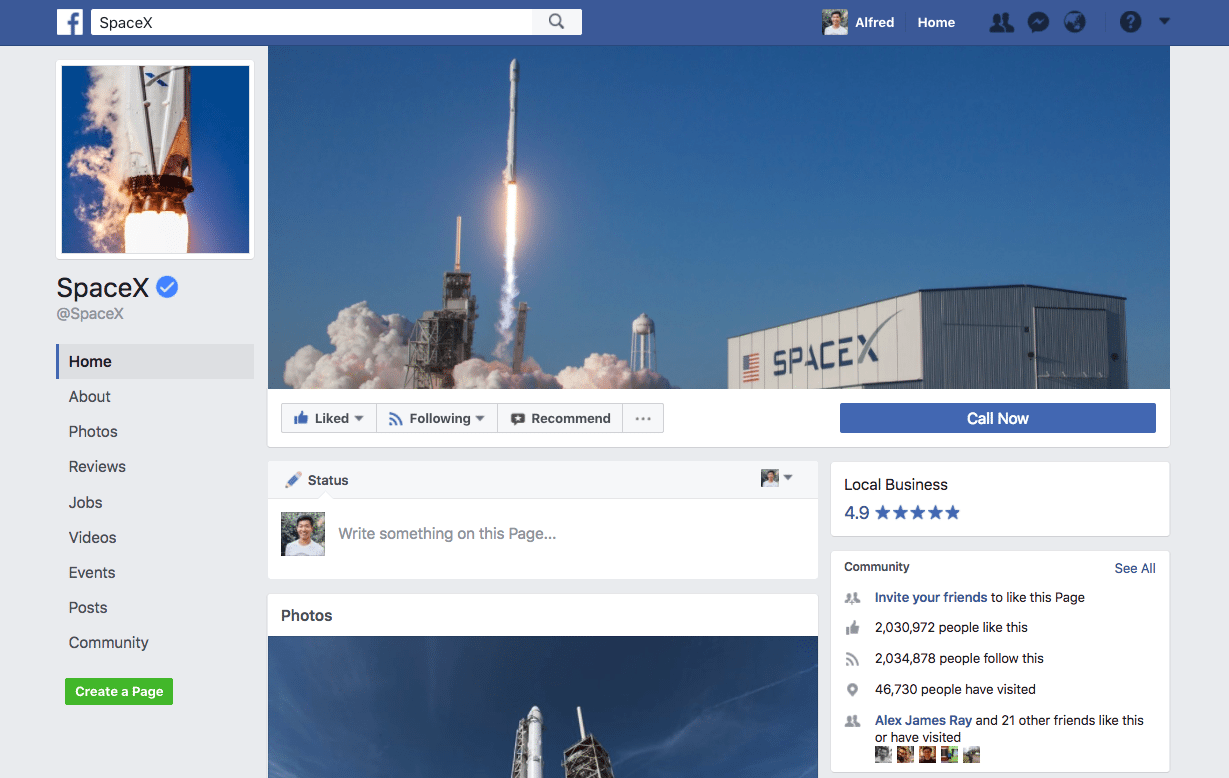
And here’s how it looks in the Facebook mobile app:

They look similar, but there is a slight difference. On mobile, the top and bottom portions are slightly expanded — by 75 pixels each — assuming you didn’t reposition the photo. The parts highlighted in red are not shown on your page when viewed outside of the app.

The cool thing here is that Facebook doesn’t stretch and squeeze the same image — they crop it. This is awesome because it ensures your image looks its best by not distorting the aspect ratio.
If you’re using text on your cover photo, like a call-to-action (CTA), you’ll want to pop over to the Facebook mobile app to make sure there’s nothing wonky going on. For example, if your cover photo is not tall enough, the sides of your photo (or a few characters of your CTA) might be cropped out on the mobile app.
How to create and choose your cover photo
Here are some places you can create or find a cover image.
1.Photoshop
If you have some design skills, creating your own cover photo using Photoshop is an excellent way to go. Going this route allows you to create a pixel-perfect representation of how you want to portray yourself or your business.
If you’re ready to start designing in Photoshop, below you’ll find a Facebook cover photo template (820 x 462px).
This is how it looks like on desktop and mobile:

If you’re also considering an update to your Facebook profile picture, keep these details in mind:
- Profile images display at 170×170 pixels on your page on computers, 128×128 pixels on smartphones, and 36×36 pixels on most feature phones
- Images will be cropped to fit a circle
2. Canvas
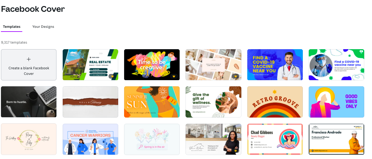
If you don’t have the advanced design skills to use Photoshop, then consider Canva instead. It’s a simple-to-use design tool that offers pre-made templates for you to customize however you would like.
3. Photos
Since your Facebook page is all about you or your business, why not use photos that best represent that?
In addition to using photos taken by you or your team, stock photos are a great option for when you don’t have the time or skills to create a design from scratch. You can find a wide range of stock photos to choose from on our list of 23+ free image sources.
If the photo license allows, we suggest editing or enhancing whichever photo you pick to match your brand or personality. You can easily do that with Pablo, Canva, or PicMonkey. For example, you could pick one of your favorite quotes and lay it over a photo.
What to consider when choosing your cover photo
Now that you know how to create your cover photo, let’s investigate the type of cover photos that work better than others.
Best practices
Everyone has advice when it comes to your Facebook cover image, but the marketing gurus at HubSpot put together a great list of dos and don’ts when it comes to cover photos. Here are some of the highlights:
- Respect Facebook’s guidelines, including required image dimensions
- Stay mainly visual and have a clear focal point
- Keep in mind how your cover photo will look on mobile
- Integrate your cover photo design with the rest of your page
What type of image attracts people?
Images that get shared the most tend to have some key features in common.
- Emotion: Make people feel something — it leads them to take action
- Relevance: Include something that fits with your audience’s interest
- Colors: Pick the right colors that will lead to the most shares
- Typography: Choose a font that will make your message clear
- Hashtags and Text: Find words that will lead your audience to interact
These components can also be applied to your Facebook cover photo to say something meaningful about your brand or to get your customers to take action.
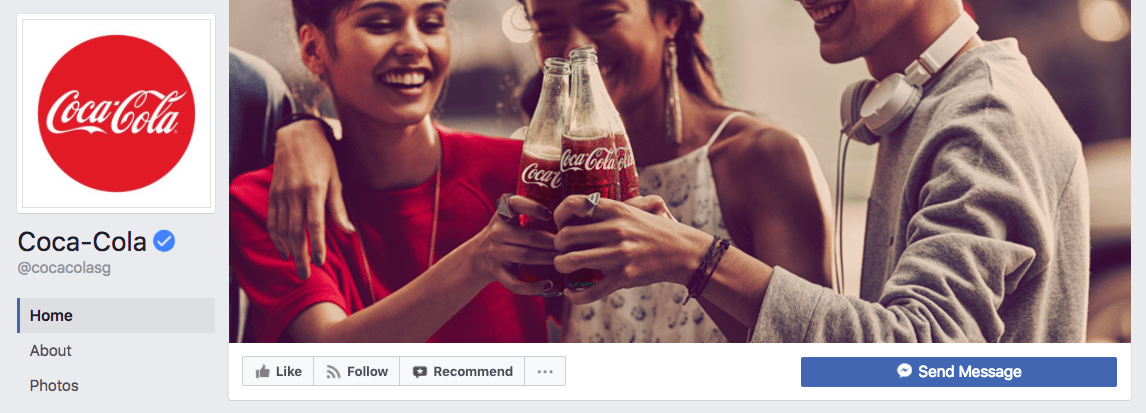
For example, Coca-Cola’s cover photo shows several happy young adults clinking their Coke bottles. This supports Coke’s brand messaging.
Where do people look?
When coming up with your perfect cover photo, it might be worthwhile to look into some eye-tracking studies. Research from the Quarterly Journal of Experimental Psychology found that if you would like to draw attention to a particular item in an image, you should use a visual queue like a person’s gaze or an arrow to guide viewers to what they should look at next.

This could be an interesting way to use a person’s gaze in your Facebook cover photo to direct attention to a certain spot in an image, such as a call-to-action (CTA).
11 Examples and Ideas for Your Facebook Cover Photo
So what should your cover photo look like? We’ve got 11 awesome ideas and examples from brands to help jumpstart your creative process.
1. Show off your team
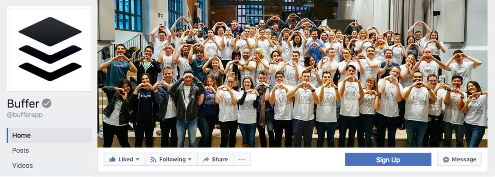
Showcasing your employees in your cover photo is a great way to humanize your brand. It inspires trust and, if nothing else, a few friendly faces your customers can relate with.
A few years ago, we used a team photo from our company retreat in Madrid as our Facebook cover photo. Our team is such an integral part of Buffer, so with this photo, we wanted our community to see the people behind the company.
2. Sum up what you do

Zapier is a platform that allows users to automate boring and repetitive tasks. When you click on Zapier’s Facebook Page, there is no question about what they do. Their tagline “easy automation for everyone” says it all.
Like Zapier, you can use your cover photo to highlight your brand’s value proposition so your fans can quickly get an idea of what your business does and has to offer.
3. Showcase your values

Your Facebook cover photo is a great opportunity to showcase your brand values and encourage people to join and support your cause. The World Wildlife Fund is committed to saving endangered species, and their Facebook cover photo clearly communicates their message and values to the fullest.
4. Display your company’s core product or service

You can leverage this prime promotional space to show off your products in a professional and eye-catching way. Ferrari does this by displaying a simple but striking photo of its red flagship car, front and center on its Facebook page.
5. Reinforce your brand identity
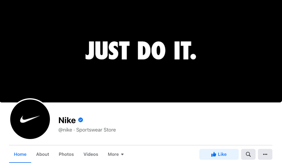
If your brand has a specific look, vibe, or catchy phrase, then show it off! Nike uses it’s classic “Just do it” tagline in its banner image. It’s instantly recognizable to Nike fans when they visit the brand’s Facebook page, and it reinforces a brand value.
6. Promote at event
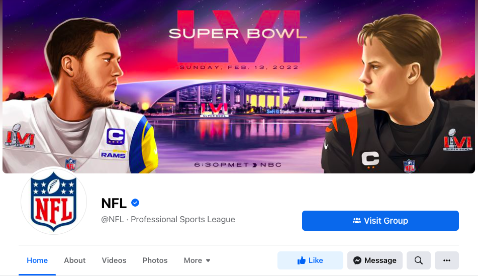
If you want to help drive a crowd to one of your events, consider using your Facebook cover photo as a billboard to promote it. The NFL did this for the Super Bowl.
7. Announce new products or features

If you’re planning to release a new product or service, then your cover image is a great space to tease or announce details about the launch. When we released Buffer’s Start Page, we updated our cover photo with key information about the new landing page.
8. Celebrate holidays or seasons

Many brands change their cover photo based on special occasions, seasons, or holidays. Experiment with seasonal colors or add traditional seasonal images like autumn leaves, pumpkins, or snowflakes. To celebrate Valentine’s Day, Costco uploaded a simple no-frills photo of roses. It’s easy to create a similar cover using stock photos and free tools like Canva.
9. Promote your social media campaigns or hashtags
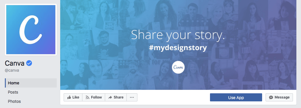
Use your cover photo to promote your social media campaigns by including a hashtag in the photo design. Canva did this a few years ago with their #MyDesignStory campaign, which told the stories of businesses and individuals who used the tool to make their small business dreams a reality.
10. Make a bold statement

If you want to make a statement that resonates or drives home a message, your cover photo is an excellent place to do just that. For example, Skillshare’s cover photo is solid proof that a big message deserves a big typeface.
11. Have some fun

Don’t be afraid to have some fun with your cover image or showcase your brand’s more humorous side. For example, the Middle Eastern Restaurant, The Chicken & Rice Guys, showed off its quirky and playful brand personality with a cover photo that looked a bit like The Beatles’ Abbey Road cover — except their staff were wearing Santa Claus hats and dressed up as chicken It’s a great way to say, “We don’t take ourselves too seriously.”
Start creating
Now that you know the ideal dimensions for your Facebook cover photo and have seen some ideas and examples to inspire you, it’s time to start creating. And while you’re at it, make sure your social media posts use high-quality images that display well in your feed. We have a social media image sizes cheat sheet that can help you with that, too.
Oh, and by the way: Buffer can help you schedule and analyze your Facebook posts — so you can drive more Facebook traffic and engagement in less time.
Did you find this article helpful? You might also like our all-you-need social media toolkit.
Get started for free now
Follow us on Facebook | Twitter | YouTube
WPAP (697)
